


New Grid Update: Columns and Resolutions explained
Posted February 7th, 2023
New Grid Update: Columns and Resolutions explained
Posted February 7th, 2023
Note: This change was introduced with version 3.3.91 of the OMNIA Platform
When developing line of business (LoB) applications, one of the great user interface design challenges comes from data visualization and input. Grids (or Tables) are often the go-to solution, for a good reason, but they pose a big challenge when combined with a device-responsive user interface.
Being impossible to deliver as much information on a smartphone as you would on a 40-inch desktop monitor, decisions needed to be made to guarantee the best user experience possible across all devices.
Today we’re detailing some of those decisions regarding how our Grids behave on different Desktop sizes and how you, the modeler, can control them and provide the best user experience for your web application:
Grids: Sizes and Resolutions
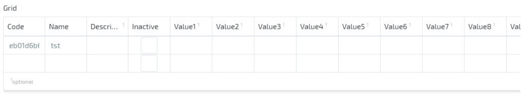
To respect our user’s desktop screen resolution there’s a limit on Lists and Grids to three resolutions that change the maximum number of columns a user can see without side-scrolling:
- Window width greater than
1920 pixels(1080p) displays a maximum of 20 columns; - Window width smaller than
1920 pixels(1080p) displays a maximum of 16 columns; - Window width smaller than
1366 pixels(720p has a width of1280px) displays a maximum of 12 columns;
Example
resolution > 1920px: 20 columns

resolution between 1920px and 1366px: 16 columns
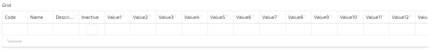
resolution < 1366px: 12 columns
Note: This change is only focused on the Desktop experience and is meant to improve the way users perceive information in cases where large amounts of columns exist.
Platform Update and Documentation
This new feature is part of our 3.3.91 version of the platform, released today.